Streamlining administrative management workflows for professors
Project overview & context
Quiz Extensions is a centralized web application embedded within Canvas, the University of Central Florida’s hub for online learning management. It enables professors to efficiently manage quiz time accommodations for students.
As a product designer, I led end-to-end design for the project; this included conducting user research and insight synthesis, wireframing, prototyping, conducting usability tests, and building a design system.
I delivered a final high-fidelity prototype in Figma to the development team.
I also developed design system components using React and AI tools to support an even smoother handoff to engineering.
Overview of my design process
How might we make accommodation management intuitive and scalable?
Students registered with Student Accessibility Services (SAS) require accommodations such as extended quiz time, and professors often need to grant additional time for unexpected situations such as illness, travel, or emergencies.
While these adjustments are essential for ensuring equity, Canvas offers no efficient way to manage them.
Professors must open each quiz individually, scroll through long student lists, locate the correct student, and manually update time settings, repeating this process for every person who needs an adjustment.
With no singular interface or clear confirmation of who has been updated, this simple administrative task becomes slow, error-prone, and unnecessarily stressful during already busy semesters. My challenge was clear:
Design a singular application for professors to manage student accommodations efficiently.
The solution: A centralized interface that simplifies decision making; bringing speed & accuracy to a routine admin task
Defining goals for user research with professors
Understand professor pain points
I set out to learn how professors currently manage quiz accommodations and what their day-to-day experience looks like. This helped me surface the most common frustrations and gaps in their workflows.
Identify where the process breaks down
I focused on uncovering where instructors were losing the most time, confidence, and visibility, when working through the management process. These moments aim to reveal the areas where support was needed.
Translate insights into design direction
I strived to use the findings from the research process to guide which features and interactions the new tool needed. These insights would ensure the final solution directly addressed user challenges rather than assumptions.
Uncovering challenges in professors’ workflows
Through interviews and surveys with five professors, I explored the experience issues with the current workflow and identified the challenges the new application should address.
Key questions I asked included:
How do you currently manage quiz accommodations for your students?
What parts of the process feel the most time-consuming, difficult, or confusing?
How do you ensure accuracy throughout the process and when making any changes?
Key highlights from conversations with professors
The interview dialogue with participants revealed just how overwhelming this process was for professors. A few standout quotes include:
“I waste time clicking into every single student individually to change the settings”
“I can never remember which quizzes I’ve already updated for students. There’s no way to see everything at once.”
“Sometimes I just extend time on a quiz for the entire class because it is easier and faster”
Making sense of user research with affinity mapping
After the data collection process, I used affinity mapping to synthesize findings and meaningfully analyze a lot of the common themes.
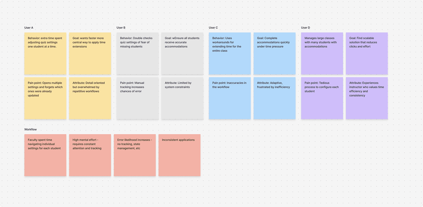
Identified patterns & themes:
Repetitive workflows: Instructors performed the same manual actions repeatedly
High mental load: Constant double-checking and manual tracking created stress
Lack of visibility: No simple way to confirm who received accommodations
Inconsistent workarounds: Professors created their own tracking systems, leading to inconsistencies
What's making accommodation management so confusing and difficult for professors?
From my synthesis, I was able to identify 3 major pain points
Inefficient Workflows
Significant time was spent navigating individual quiz settings; Too many steps for a simple task
High Cognitive Load
Management across multiple students requires constant attention and mental effort to track and keep records of.
Error-Prone Process
Increased likelihood of mistakes and missed accommodations; Easy to miss students or enter incorrect information.
Establishing design goals for the new application
Based on research insights, I defined goals to guide my design thinking for new features and interfaces going forward:
Centralize Actions
Handle everything in singular flows & interface
Simplify Tracking
Reduce clicks, effort, and mental load throughout the workflow
Provide Transparency
Confirmation and progress feedback for the user to recognize advancement
Minimize Errors
Design safeguards and verification steps that ensure accuracy and safety
The guiding question that shaped my design decision making going forward:
How might we make the accommodation management process simple, intuitive, and scalable for instructors?
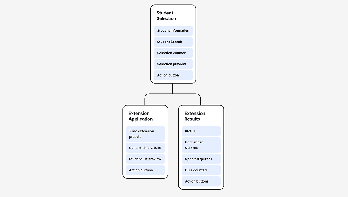
Laying the foundation for a scalable workflow
I created a site map early in the process to establish the application's structure. This artifact served two purposes:
Communicate with engineering about feature implementation
Understand available data points (student names, IDs, etc.) and technical feasibility
Early design explorations
I began with low-fidelity sketches and wireframes to explore potential solutions. These artifacts helped me:
Visualize different approaches
Communicate ideas with engineers
Receive early feedback and iterate quickly
Navigating design tradeoffs & making iterative decisions
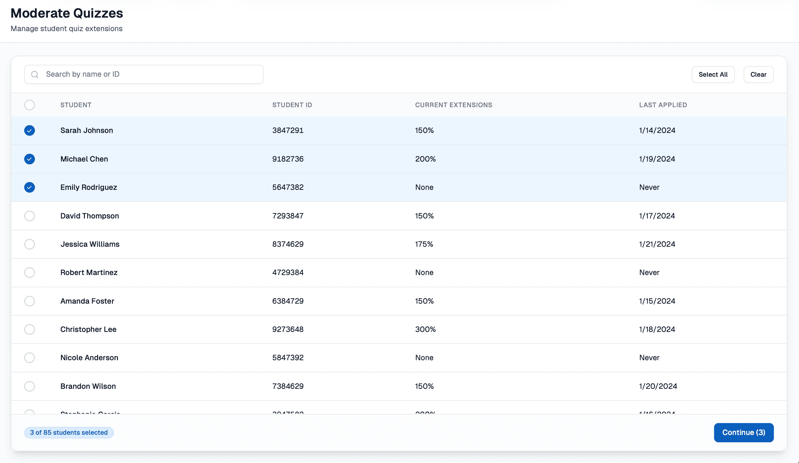
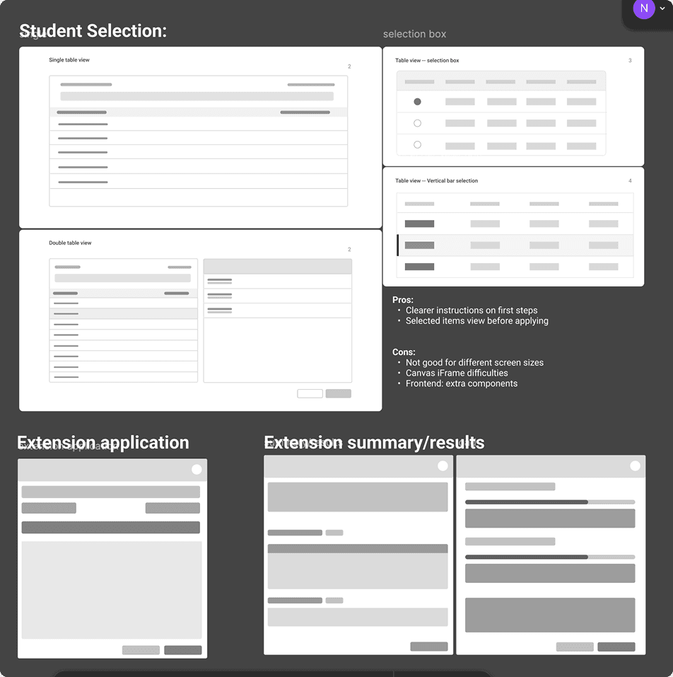
Challenge 1: Making student selection faster, clearer, and more reliable
Goal: Enable instructors to quickly select groups of students and batch-apply time extensions while reducing errors and building confidence.
This directly addressed our pain points around inefficiency and error-prone workflows.
Challenge 2: Maintaining confirmation without split attention
Goal: Preserve professors’ sense of awareness and confirmation during batch actions without forcing them to shift focus between multiple panels.
While the two-column layout had issues in scalability and attention, the sense of awareness and confirmation it provided to users was valuable.
Solution: Hover-activated preview list; shows a quick summary of selected students, allowing verification without interrupting workflow progress.
Challenge 3: Saving time and ensuring accuracy during time extension application
Goal: Address pain points around cognitive load and error-prone workflows by allowing instructors to apply extensions quickly and accurately without overthinking.
Solution: Preset time options based on commonly mandated extension times that professors typically receive. Custom time extensions are also accounted for!
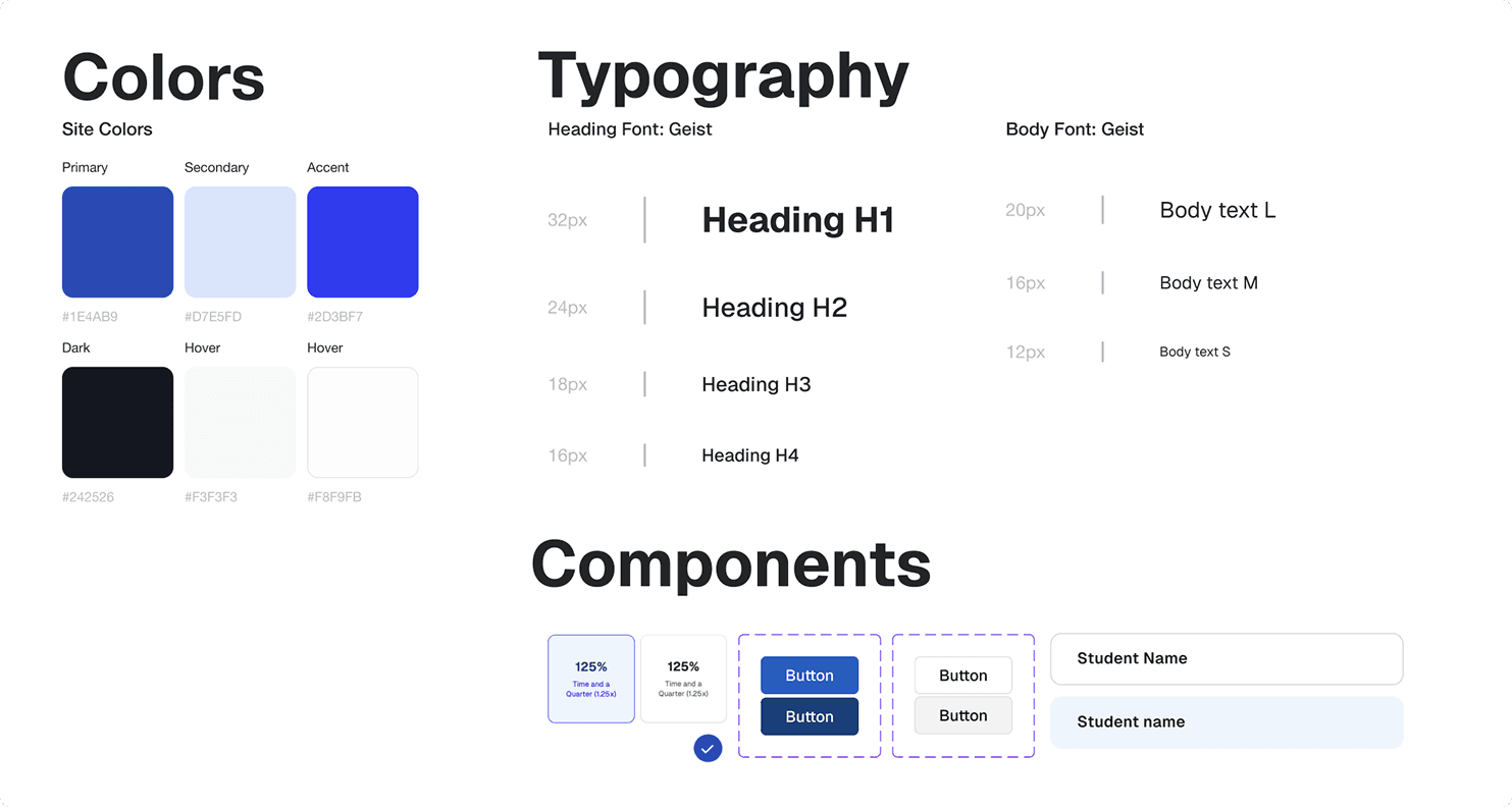
Creating a design system for accessible admin workflows
Throughout the design process for the project's design system, I ensured all components met WCAG 2.0 compliance standards.
Accessibility considerations:
Proper color contrast ratios for text and interactive elements
Keyboard navigation support
Screen reader compatibility
Clear focus states
Beyond compliance, I wanted the interface to feel familiar to professors. I made sure components and design patterns were aligned with other Canvas-based applications they already use, reducing the learning curve.
Final design prototype!
Impact & takeaways
This project was successfully handed off and shipped in Fall 2025.
With a centralized workflow for accommodation management, professors at UCF can now spend significantly less time on this administrative task and more time supporting their students.
Key takeaways:
Asking the right questions and collaborating often makes good design possible
Being intentional and asking the right questions, staying in close communication with engineers, and iterating often helped me understand key technical constraints and backend processes within the accommodation workflow. This clarity allowed me to make informed and feasible design decisions for the new application.
Always returning to the user
This project reminded me that every design decision needs to ladder back to real user needs. Staying grounded through interviews and user testing helped me validate what actually mattered to professors and avoid adding unnecessary irrelevant complexity within the design process.
