Improving the user experience of an internal accessibility tool used in digital classrooms
ROLE
Product Designer
TEAM
1 Designer
2 Engineers
TIMELINE
June 2025 - August 2025
TOOLS
Figma
Protopie
HTML/CSS
What is the Universal Design Inspection Tool?
Universal Design Inspection Tool (UDOIT) is an internal faculty tool developed by UCF’s Center for Distributed Learning (CDL).
Its primary goal is to help faculty identify and fix accessibility barriers in their online classes, ensuring that digital classrooms meet institutionally required compliance standards and students are able to have an equitable digital learning experience.
By streamlining what was once a manual review process, UDOIT provides a scalable, instructor-focused solution.
The tool's current flow:
Class content is scanned for WCAG violations (missing alt text, color contrast, etc)
Audit summary of accessibility barriers is generated
Faculty resolve flagged accessibility barriers in-app
Barrier is unflagged & resolution actions are marked for review
Web Accessibility Is Confusing And Intimidating!
The tool's original interface often made accessibility compliance feel confusing and overwhelming, leaving faculty unsure where to begin and unintentionally allowed accessibility barriers to remain unresolved for students who relied on accessible course content.
The Solution? Creating A Faster & Clearer Path To Compliance
The redesigned interface and features of the UDOIT summary screen clarifies information and transforms accessibility compliance into an opportunity for equity.
Our Solution's Positive Impact on Faculty Members
Through user interviews and surveys, we felt confident shipping the new UI for the summary and barrier pages. Faculty were able to use the tool and take action to resolve accessibility barriers with less confusion.
40%
Faster Task Completion Time
Faculty resolved the issues that were flagged by the tool 40% faster with the redesigned summary and issue pages, navigating with clearer context.
100%
Increased Confidence
20 / 20 of faculty who took our survey felt more confident using the tool to fix accessibility issues in their online courses after the interface design changes.
VIEW THE PROJECT PROCESS
01. Understanding Faculty Needs & Ambiguity
To understand issues with the current user experience, my research process involved understanding faculty perspectives through structured interviews and collaborative feedback sessions.
I engaged directly with faculty across different technical comfort levels and understandings of accessibility compliance.
I observed how faculty navigated and interacted with the current tool's UI to uncover points of confusion and usability barriers.
Some examples of product confusion and questions asked by the faculty are:
"How do I start fixing an issue with my course content?"
"Which issues should I prioritize first?"
"What does this specific issue mean?"
02. How Can We Make Web Accessibility Approachable & Important For Faculty?
Further interviews, surveys, and feedback sessions revealed several important insights that guided my design approach. These are some of my defined usability barriers:
Accessibility Literacy Gap
Many of the educators had a limited understanding of WCAG standards and general accessibility principles. Contextual education alongside issue identification was needed for them to make informed decisions.
Interface Navigation Gap
Faculty experienced disorientation with navigation patterns. Many would lose their place within the interface and struggle to return to previous screens or understand their current location within the workflow.
Ambiguity with Actionable Steps
Faculty expressed strong preference for more clarity on the steps required to remediate issues. The original summary page felt daunting and unapproachable.
Critical pain points with the ORIGINAL UI:
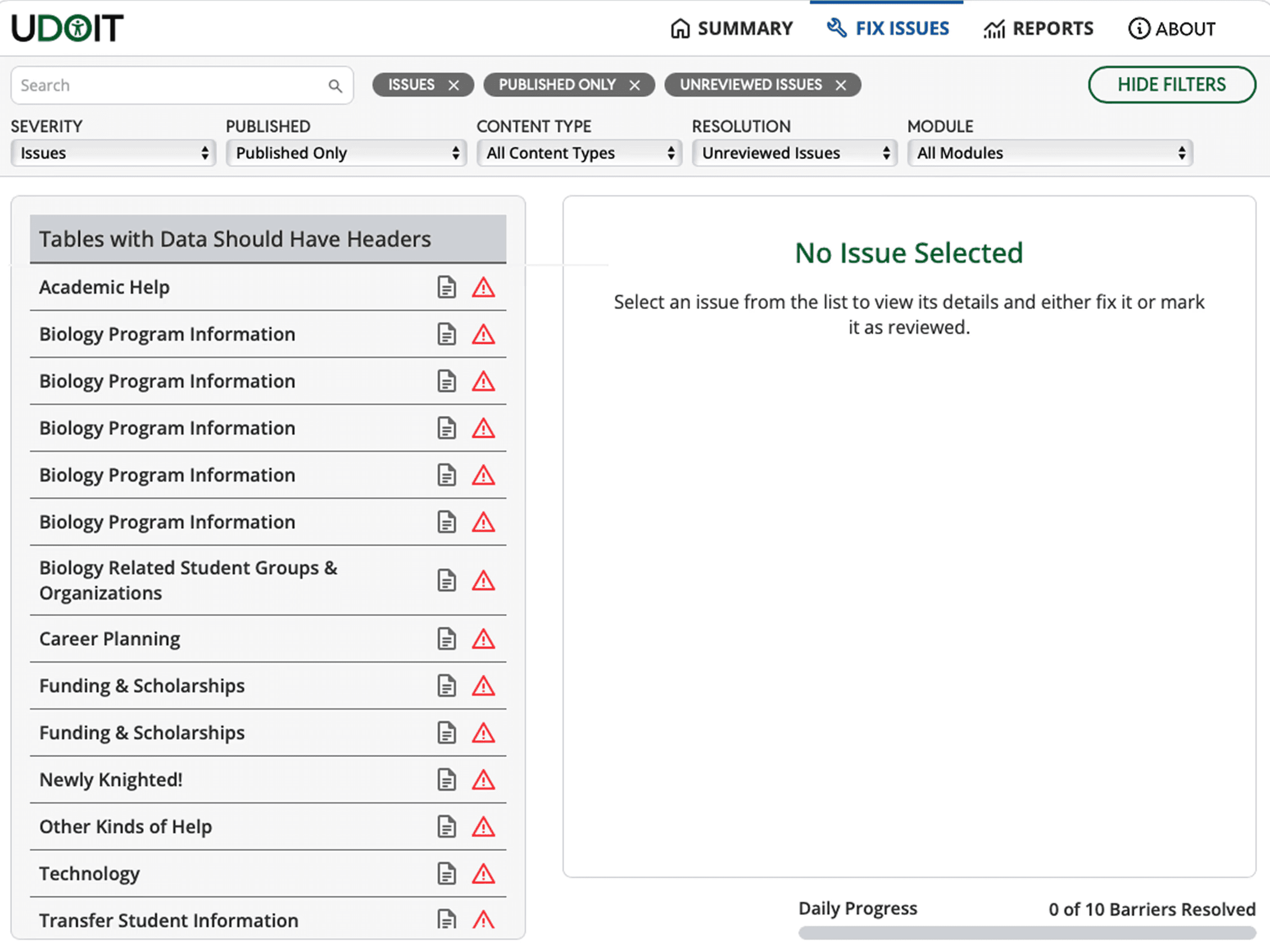
Informational Overload
The two column view did not communicate steps that the user should take in a clear way. Flagged pages were not seen as actionable links and issues lacked visual hierarchy.
Weak impact during testing
Slower time using the tool & more questions asked by users in our test group. The issue icons on their own did not provide clear context on the issue categories and created more confusion.
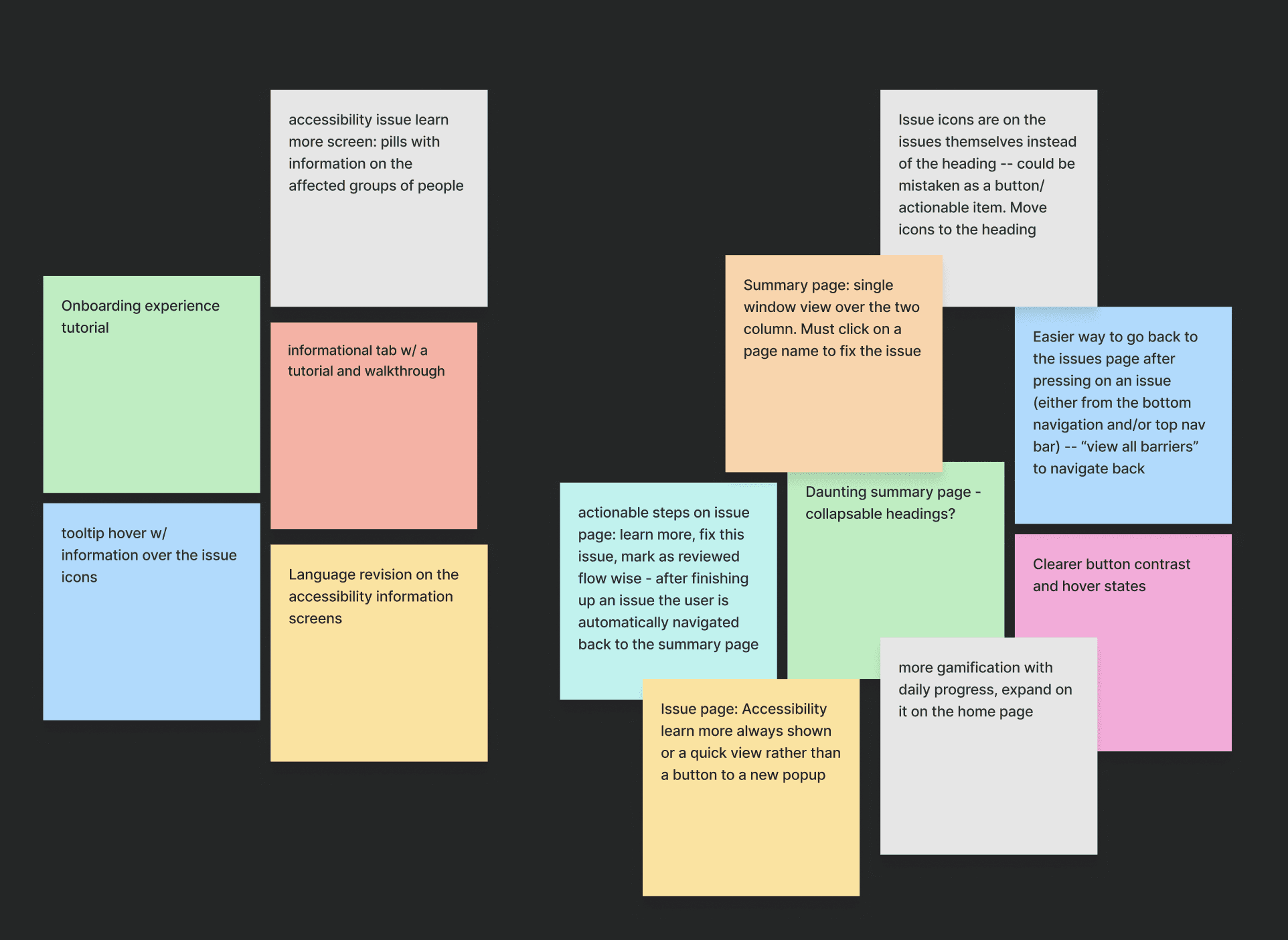
03. Brainstorming Possible Design Solutions
Using faculty feedback, my team and I worked together to brainstorm key features and UI improvements for the issue summary page and the issue pages, addressing the identified usability barriers.
04. Navigating Constraints & Challenges
Cross functional meetings between myself, engineering, and product allowed us to define the constraints and parameters that the final solutions would need to respect. This made sure that all of the design work was feasible and aligned with our goals.
Canvas LMS iFrame Limitations
Because the tool is integrated into the Canvas learning platform, designs had to account for a fixed and constrained viewport with limited control over certain interactions.
Engineering & Timeline Accommodations
The search and filtering components, along with adding new pages were not designed to accommodate to engineering requirements and avoiding additional development overhead within the project timeline.
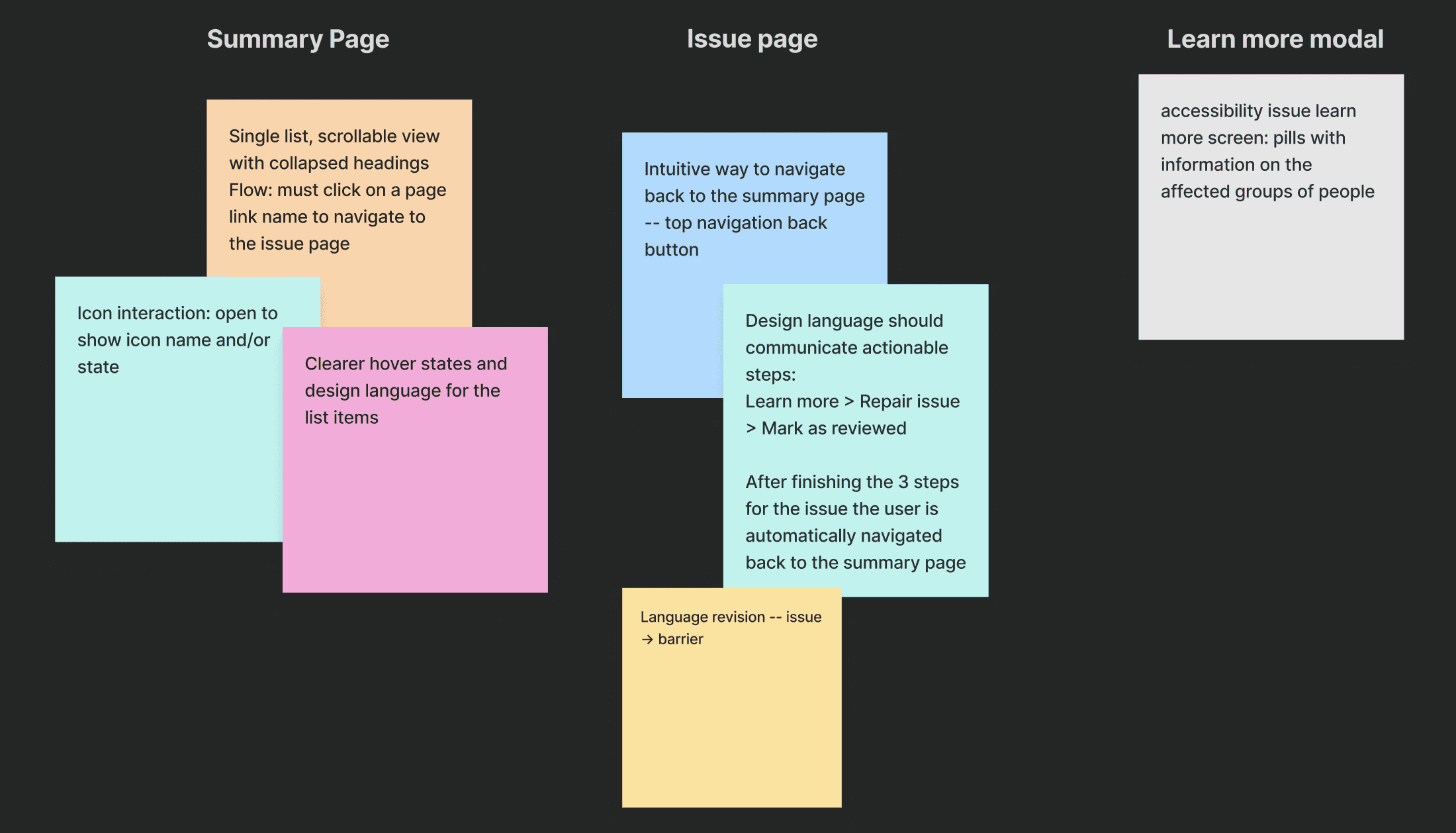
05. Narrowing Our Scope
After another critique and testing session with faculty, our team prioritized the key changes and features to implement for each final screen, while deciding which ideas to set aside. These decisions were made with project and timeline constraints in mind.
06. Design Iterations & A/B Testing Highlights
These are a few of the past iterations of high fidelity screens that I used to communicate with my team and also amongst our user testing groups. Throughout these iterations, I made a number of tradeoffs to balance usability, technical feasibility, and timeline constraints.

Reduced Cognitive Load Within Constraints
Minimized information overload through clear label interactions that highlighted severity, status, and document type
Collapsible headings + single column layout adapted to LMS constraints, allowing for responsiveness and scannability across different screen sizes.
** This is an example of one of many different types of flagged issue pages
Clearer Flow With Helpful Context
Distinct steps and visual feedback reduced user confusion and reinforced a sense of progress.
Contextual previews were strongly preferred, giving users immediate insight into each flagged issue without opening a new page or modal, reducing time spent understanding the problem
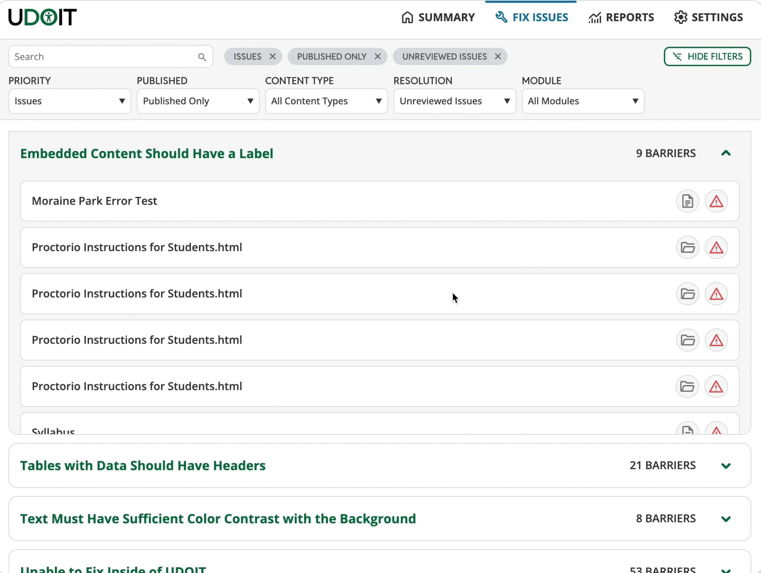
07. What We Shipped!
Issue summary screen
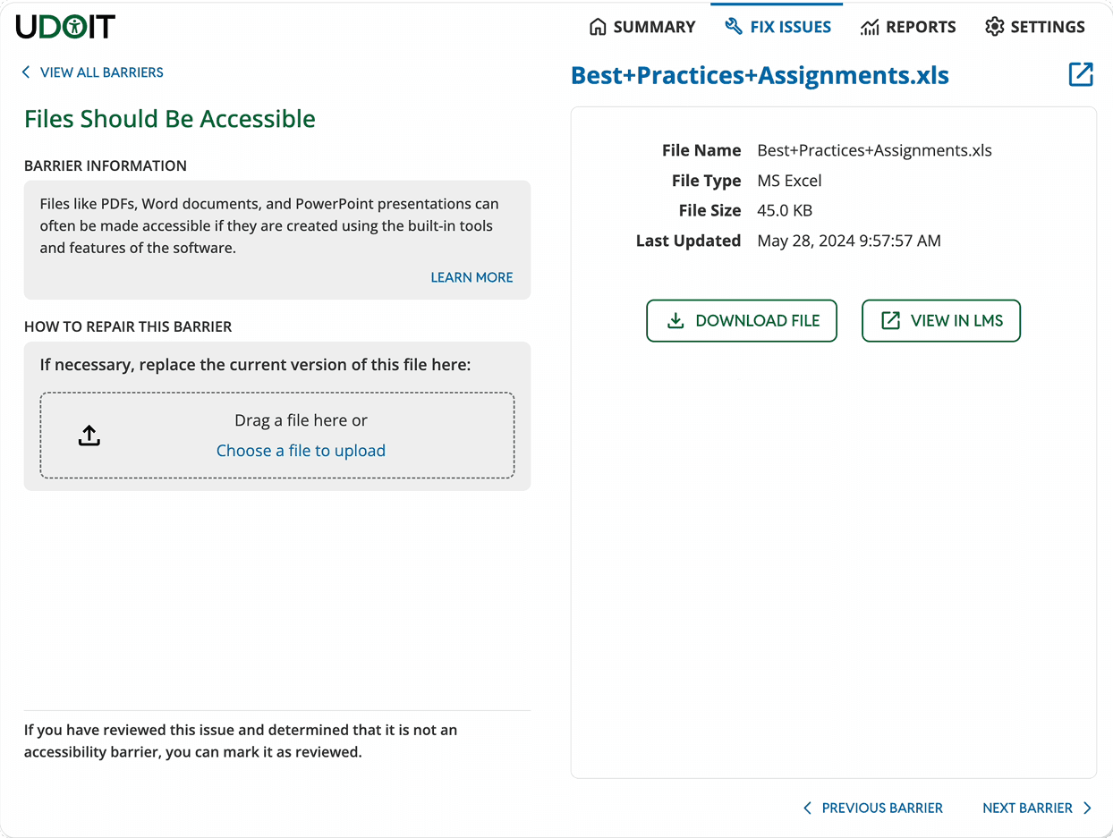
Example of an individual issue page
08. Project Takeaways
This project gave me one of my first opportunities to step into the role of a product designer, and collaborate cross-functionally on a real world. I’m grateful for the experience and for being able to deliver improvements that genuinely made faculty member's workflows easier!
Team Collaboration & Feedback
Collaborating with my team members and getting feedback from our users was an invaluable part of the design process. I could see how each design iteration performed, and this feedback loop made the process insightful and successful!
Future Improvements & Opportunities for Broader Impact
Since timeline and technical constraints shaped a lot of the design process, expanding the scope to additional screens and conducting broader, more quantitative testing could reveal further areas for improvement. Looking ahead, the team plans to continue enhancing UDOIT by refining key features and updating the interface design system language.
Thanks for reading :-)
Feel free to reach out if you have any questions!
